macOS 27 lets users dial back Liquid Glass. Design for that.
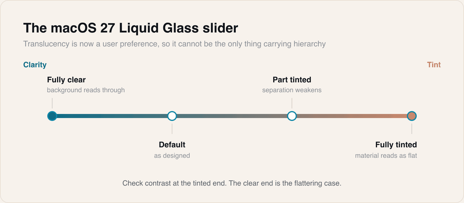
Golden Gate adds a slider that moves the interface from clarity to tint. Any hierarchy your app builds out of translucency is now user-adjustable.
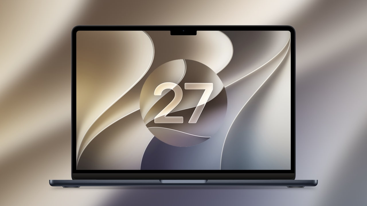
macOS 27 Golden Gate shipped on 14 September for Macs with M1 or later and the MacBook Neo. Among the interface changes is a Liquid Glass slider that moves the system between clarity and tint, alongside sharper app icons, Safari tab organisation by topic, and better search ranking in Spotlight, Photos and Mail.
The slider is a small line in a long release note and the most consequential item on it for anyone maintaining a design system.
A user-adjustable material is a variable, not a constant
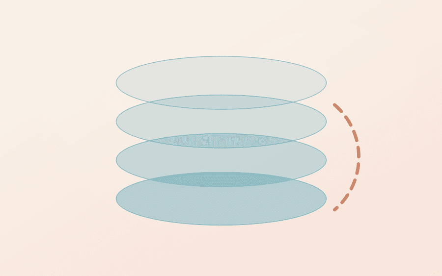
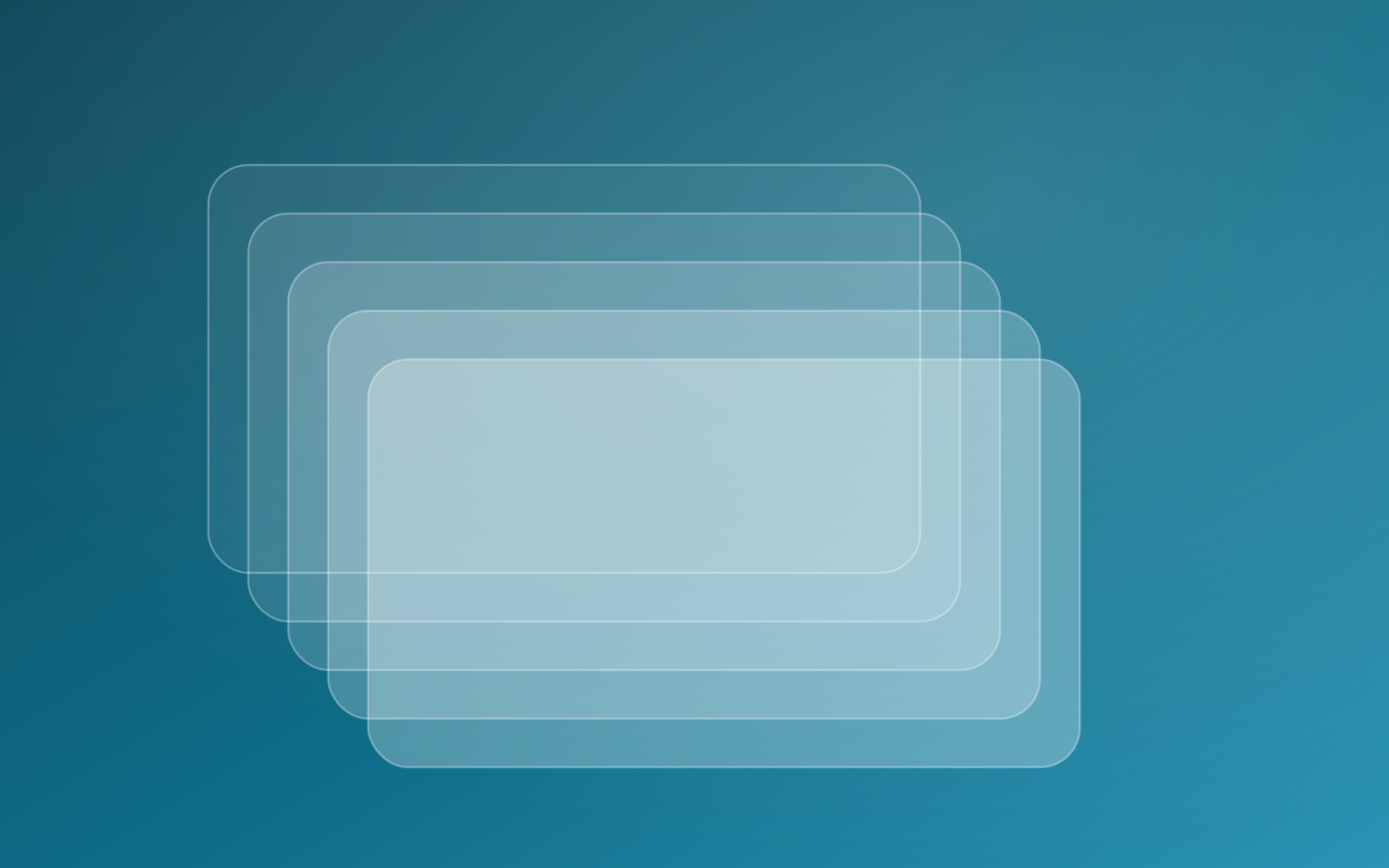
Since Liquid Glass arrived, a lot of interfaces have quietly started using translucency to carry meaning. A floating bar reads as elevated because you can see through it. A sidebar separates from content because it tints what is behind. A modal feels modal because the background shows through, blurred.
If the user can move that material toward tint, every one of those signals weakens at the same time. The layout does not change and nothing breaks, so this will not show up in a snapshot test. It shows up as an interface that is slightly harder to read, for reasons the user cannot articulate.
The rule we use
Translucency is allowed to make hierarchy more pleasant. It is not allowed to be the only thing carrying it.
In practice that means every elevated surface also earns its separation some other way: a real contrast step, a border, spacing, or a shadow. Then the material is decoration on top of a structure that already works, and a user moving a slider changes how the app feels rather than whether it can be read.
- Check every floating or translucent surface at both ends of the slider.
- Check it again with Reduce Transparency, which has been available for years and is the same test with a blunter instrument.
- Measure contrast against the tinted state, not the clear one. The clear state is the flattering case.
- Watch text sitting directly on a material. That is where legibility goes first.
If an interface only works at one setting, it does not work.
This is an accessibility pattern in commercial clothing
The useful way to think about the slider is that Apple has taken an accessibility setting and made it an ordinary preference. The audience for it just grew from people who needed it to people who simply prefer it.
That is the general shape of a lot of platform work now, and it is a good argument to bring to clients who treat accessibility as a separate phase. The setting your app ignores because few people enable it has a habit of becoming the setting everybody has.
Sources
Reporting and images linked above belong to their respective publishers and are shown from their own servers. The analysis here is our own.