iPhone 18 Pro and Pro Max: more rows, not bigger text
Both new Pro phones run at the same pixel density, so the larger one does not magnify your interface. It shows more of it, and that is a design decision.
The iPhone 18 Pro has a 6.3 inch display at 2622 by 1206, and the Pro Max has a 6.9 inch display at 2868 by 1320. Both are 460 pixels per inch, both run at 120Hz, and both reach 3000 nits outdoors. The cameras are identical. The Max weighs 249 grams against 211, and is rated for 45 hours of video playback against 36. The difference in price is one hundred dollars.
The constant density is the part that matters to anyone laying out an interface, and it is regularly misunderstood.
The big phone is not a magnifier
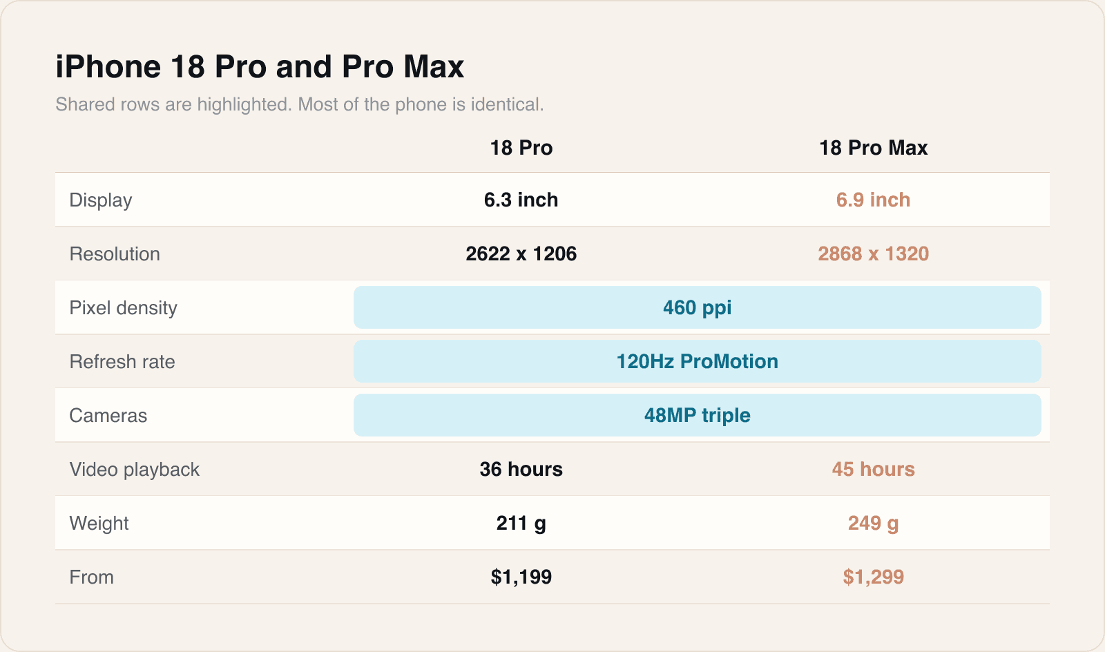
Because the density is the same on both, a point is the same physical size on both. Your body text is not larger on the Max. Your buttons are not larger. What the Max gives you is more points of canvas, which means more content visible at once.
So the design question posed by a larger phone is never how things should scale. It is what should fill the extra room.
Three answers, in order of how often they are right
- More items. A list simply shows more rows. This is correct far more often than teams expect and costs nothing.
- More context. A detail view keeps a summary visible that the smaller screen has to push off screen. Good when the relationship between the two is genuinely useful.
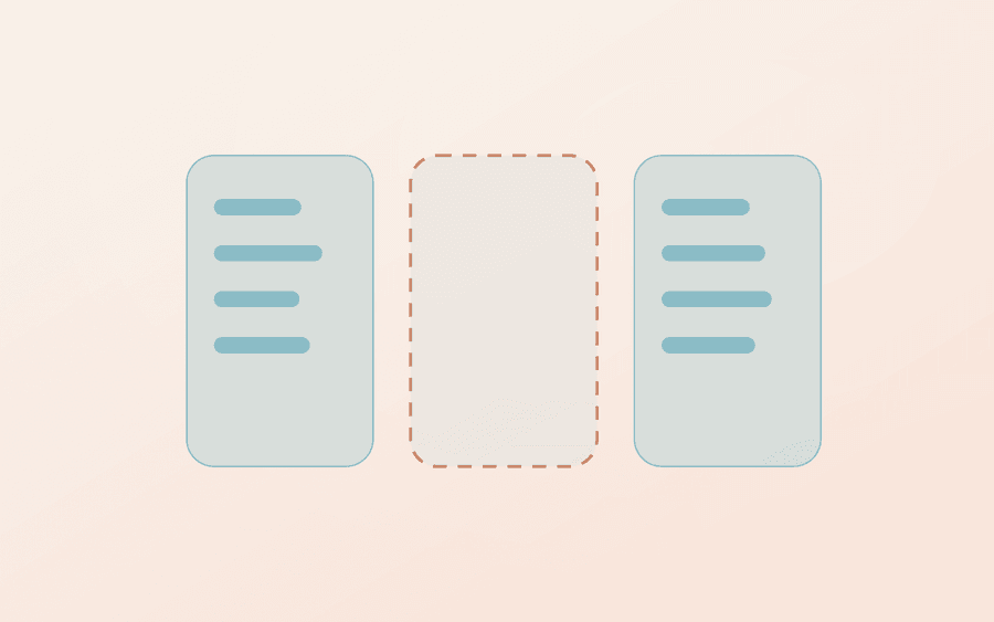
- More layout. A split or two-column arrangement appears. Occasionally right, frequently an excuse to add a pane nobody asked for.
The failure mode is the fourth answer nobody admits to, which is more whitespace by accident. That is what you get when a layout is centred with a maximum width and never revisited, and it is why the Max sometimes shows less usable content than the Pro despite having more room.
Design on the small one
Our working rule is that the 6.3 inch size is the design target and the 6.9 is the check. Designing on the large phone and shrinking produces cramped interfaces, because every decision was made with room that the smaller device does not have.
The reverse direction is much safer. Anything that works at 6.3 will work at 6.9, and the only question left is whether the extra space has been used or merely left.
Design for the smallest supported screen. Everything else is an improvement.
Reachability is the other real difference
The Max is 13.4 millimetres taller and 6.1 wider. For one-handed use that puts the top corners genuinely out of range for a lot of people.
Primary actions belong in the lower half of the screen on both devices, and the Max is the device that makes the cost obvious when they are not. A destructive action in a top corner is a design decision that gets tested every time somebody is holding something else.
Sources

Reporting and images linked above belong to their respective publishers and are shown from their own servers. The analysis here is our own.