tvOS 27 expands text size controls. Check your TV app.
Larger text is now available across more of the Apple TV interface. Ten-foot layouts tend to break at large sizes in ways nobody sees on a desk.
tvOS 27 shipped on 14 September with high resolution lossless audio for Apple Music, a redesigned Podcasts app, and expanded text size controls across more of the Apple TV interface.
The text size item is short and easy to skip. It is also the one most likely to expose a problem in a TV app that has never been tested at anything other than the default.
The ten-foot interface has a specific failure mode
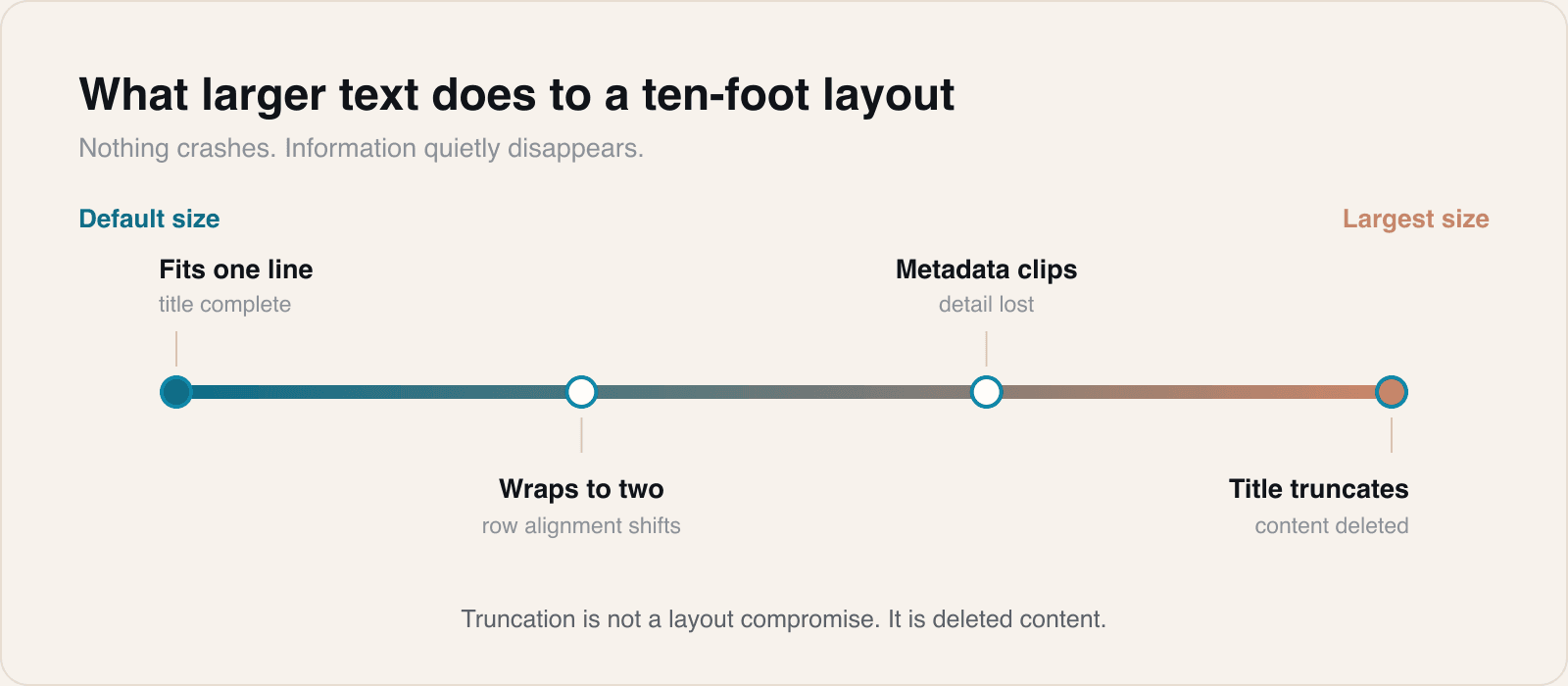
TV layouts are built around a viewing distance, which pushes designers toward large type, generous spacing and horizontal rows of content. It is a constrained grid, and constrained grids are exactly what break when the type gets bigger.
The symptoms are consistent. Titles that fitted on one line wrap to two and push a row out of alignment. Metadata truncates to uselessness. A description that carried the only real explanation of what a thing is gets clipped after four words. Focus rings stop matching the content they surround.
None of this fails loudly. It renders, it is just worse, and the person experiencing it is the person who needed the setting.
Why TV apps are the least tested surface
Honestly, because reviewing one is inconvenient. It needs a television, a remote and a room, rather than a window on the machine the work was done on.
The predictable result is that TV accessibility settings get checked less than anywhere else, on the platform where the audience is most likely to include someone reading at distance or with reduced vision.
A short check that catches most of it
- Set text to the largest available size and walk the primary browse, detail and playback screens.
- Look for truncation first. It is the most common failure and the most damaging, because it silently removes information.
- Check that focus still lands where it looks like it lands once elements have resized.
- Test with a long title in a language you are not designing in. English is the shortest common case and the most flattering one.
Truncation is not a layout compromise. It is deleted content.
The general principle
If a layout can only be correct at one text size, it is not really a layout, it is a picture of one. That applies on every Apple platform, and the TV is simply where it is easiest to get away with, because so few teams ever look.
The fix is nearly always the same, and it is not clever. Stop giving text a fixed height, let containers grow, and decide in advance which element is allowed to take the extra space when something gets longer. Most TV layouts break because every box was sized for the content that existed on the day it was designed.
We have started treating the largest text size as part of the definition of done for any TV work, in the same way a dark appearance is. It adds an hour to a review and removes a category of bug that otherwise reaches the people least able to work around it.
Sources
Reporting and images linked above belong to their respective publishers and are shown from their own servers. The analysis here is our own.