Apple Pay's enhanced payment sheet in iOS 27 lets you swipe between cards
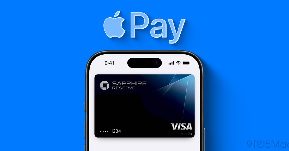
Apple has redesigned the Apple Pay checkout sheet in iOS 27, so a card is changed by swiping on it rather than by finding a button underneath.
Apple has redesigned the Apple Pay payment sheet in iOS 27, and the card a purchase is charged to is now changed by swiping across it.
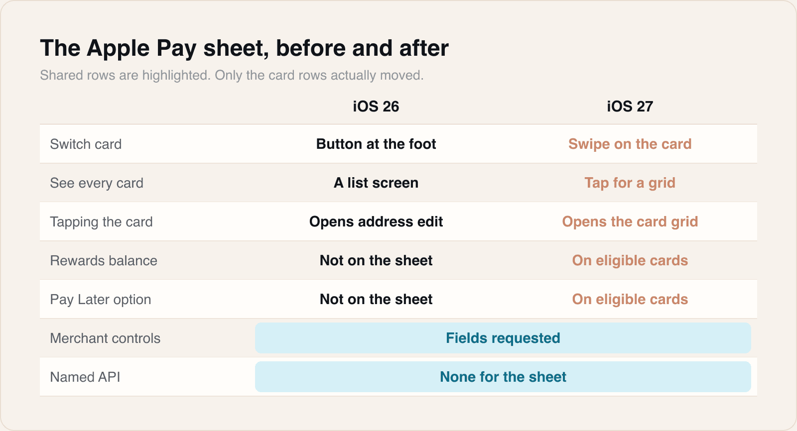
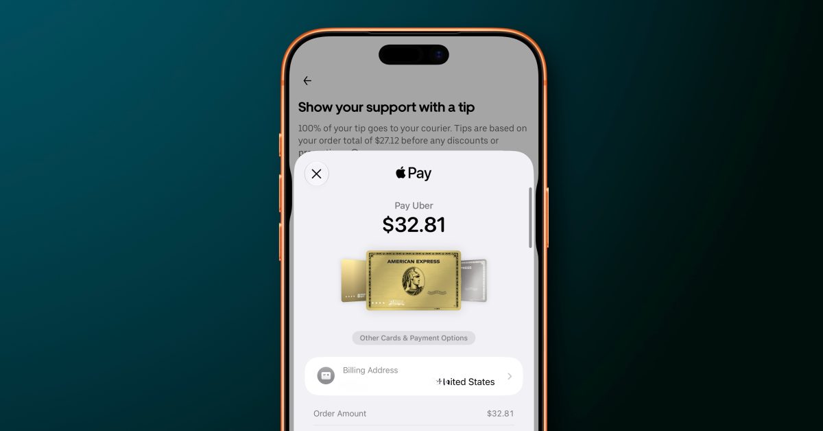
Apple calls the redesign the enhanced payment sheet, and its Apple Pay page for developers records it as available in iOS 27 or later, for checkout both in apps and on the web. The company's own description is that the design lets people "seamlessly swipe to switch cards", while surfacing information about eligible cards held in Apple Wallet. Apple lists that information as rewards, balances, a debit account balance and pay later options. Tapping a card, rather than swiping it, opens a grid showing every card available for the purchase, according to 9to5Mac.
What this replaces is worth stating precisely, because the change is small and the annoyance it removes was not. In iOS 26, switching cards meant finding a separate button at the foot of the sheet. Tapping the card itself, which is what most people tried first, opened the address editing interface instead. That account is 9to5Mac's, from hands-on use rather than from Apple, and Apple's own page does not describe the old behaviour at all.
The sheet is not the only Apple Pay change carried by iOS 27. Apple's page also documents Tap to Share, which lets a merchant's iPhone connect to a customer's device over NFC to exchange checkout data, and gives that feature a narrower requirement: iOS 27 and later, and iPhone 12 and later. Separately, 9to5Mac reports an American Express integration that allows reward points to be applied at Apple Pay checkout, at a redemption rate of 0.7 cents per point, and a debit card reload option limited to some banks. Apple names no participating banks, no regions and no launch dates for those.
What changed on the sheet
Our take
This is a correction of an interface error rather than a new capability, and it is the more valuable kind of change for exactly that reason. The old sheet punished the obvious gesture. A card is a rectangle showing a card, so people tapped it, and were taken to an address form that had nothing to do with what they wanted. Apple did not add a feature to fix that; it moved the action onto the object it belongs to. A payment sheet appears at the moment a person has already decided to spend money and is looking for a reason not to, which makes it one of the few screens in the system where a second of confusion has a direct price.
The information Apple is now putting on the sheet is the part with commercial weight behind it. Rewards balances, available credit and pay later eligibility have always existed in Wallet, one screen and one context switch away from the checkout. Moving them into the moment of choice changes which card gets charged, and that is not a neutral piece of design: card issuers care a great deal about which of their products sits at the front of a wallet, and the enhanced sheet is now a surface where that gets decided. The American Express points integration is the same idea made explicit. We would expect more issuer specific surfacing on this sheet, not less.
For anyone shipping an app that takes Apple Pay, the useful observation is what Apple's page does not say. It names no API for the enhanced sheet. There is no adoption step described, no new request type, and no flag to set. The sheet is presented by the system, and what appears on it is still governed by the fields a merchant requests to complete the order, which is how it worked before. So the practical work is not integration work; it is checking that a taller, denser sheet has not broken assumptions made when the sheet was shorter. Anything that measured the checkout, screenshotted it in a test, or timed how long a person spent on it is now measuring a different screen.
There is a testing point underneath that. A card switch is now a swipe on a control that sits inside a system sheet, and any automated checkout test that drove the old button by position or by accessibility label is testing something that no longer exists. That will not show up as a build failure. It shows up as a test that passes against iOS 26 simulators and fails the first time the suite is pointed at iOS 27, which for most teams will be the week they were not looking. Worth running once now rather than discovering during a release.
What we cannot tell yet is reach. Apple's own wording is careful about eligibility, saying the sheet surfaces information about eligible cards, and eligibility in Wallet has always depended on an issuer doing work at their end. Which banks supply a live balance, which supply rewards, and how much of the world sees an unchanged sheet with nothing extra on it, are all questions the documentation leaves open. A redesign that shows rich information for one card and a bare rectangle for the next is a different product from the one in Apple's screenshots, and only the next few months of issuer rollout will say which one most people get.
Sources
 What's New in Apple PayApple, 2026-09-15
 iOS 27 makes a great change to Apple Pay on iPhone9to5Mac, 2026-09-27
 Apple Pay just got even better with four new features and more9to5Mac, 2026-09-22
Reporting and images linked above belong to their respective publishers and are shown from their own servers. The analysis here is our own.