
Apple Music's icon goes black and white in iOS 27.2 beta 4, and red leaves the Music app
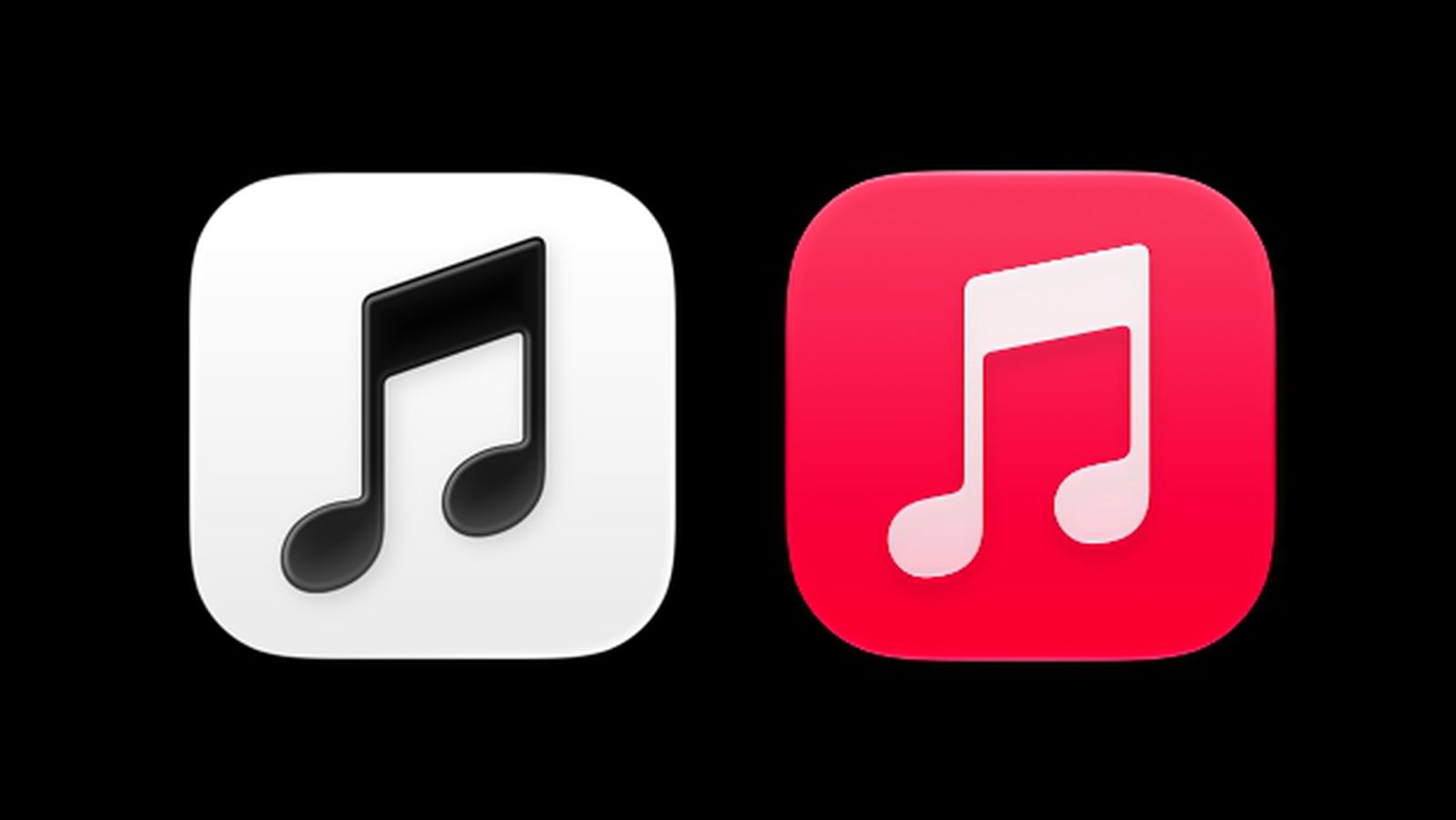
iOS 27.2 beta 4 gives Apple Music a black and white icon, a blue tab bar and black widgets, replacing the red that has marked the service for years.
Follow this story
Apple Music rebrand
Apple Music's icon goes black and white in iOS 27.2 beta 4, and red leaves the Music app(you are reading this)
The fourth beta of iOS 27.2 replaces Apple Music's red and white app icon with a black and white one.
In light mode the new icon is a black Music logo on white, and in dark mode a white logo on black, according to both MacRumors and 9to5Mac, who each installed the beta on 13 October. It follows the new Apple Music logo, set in a bolder typeface, which first reached iOS 27.2 in beta 3 after appearing in marketing for Apple Music Hall.
What else changed in the Music app?
- The selected tab in the tab bar is highlighted in blue rather than red.
- Text in the Music app's settings switches from red to blue, MacRumors reports.
- Music widgets use a black background instead of red.
- In the Library, the list of sections such as Playlists, Albums, Artists and Songs loses its colour for a black and white design, according to 9to5Mac.
Apple has not commented. These are beta changes, and Apple can still revise or reverse them before iOS 27.2 is released, which MacRumors expects later in October.
Why would Apple take the colour out?
Apple has not explained it, so what follows is our design reading rather than reporting. Red and pink have identified Apple Music for years. A monochrome icon is unusual on a home screen where Apple's own apps are almost all strongly coloured, and it puts the weight on the logo's shape, the new heavier typeface, rather than on colour recognition.
Our take
The blue tab highlight is the more telling change. Blue is the system's default accent colour, so a Music app that highlights in blue is one that has stopped carrying its own brand colour inside the interface and lets the system's colour show through. Read together with the black widgets, this looks like Apple separating the Apple Music brand, now a black and white wordmark that works on a concert hall, a TV and an Android phone, from the iOS app, which increasingly behaves like any other system app.
There is a cost. A colourless icon is harder to find at a glance, especially for people who locate apps by colour before they read labels, and it sits awkwardly beside tinted and clear icon modes that already strip colour on purpose. APPDOOK would expect user feedback on findability during the remaining betas to decide whether the white version survives as the default.
It is also consistent with Apple loosening its grip on colour elsewhere: macOS 27 already lets users turn Liquid Glass's tint and translucency down, and the Android app has had its own Liquid Glass redesign in beta. The icon is the most visible step yet, and the one most people will notice when 27.2 ships.
Sources
 iOS 27.2 Adds New Apple Music IconMacRumors, 2026-10-13
 iOS 27.2 adds new app icon for Apple Music, more design updates9to5Mac, Ryan Christoffel, 2026-10-13
Reporting and images linked above belong to their respective publishers and are shown from their own servers. The analysis here is our own.
How we report: editorial policy. Spotted an error? Report a correction.
Newsletter
Apple news, in your inbox
Get APPDOOK's Apple news by email, checked against the source like everything here.
Follow APPDOOK
New Apple stories every day, checked against Apple’s own sources.